Thursday, February 15, 2007

EE Valentines


The Edgar and Ellen Valentines episode has now aired on television and so now I feel free to post a couple of the designs I did for it. I had allot of fun with each of these. For some strange reason I was unable to find a finalized color version of the cafe, which is too bad. Come to think of it, I've never seen a final color of it. I know it's in the show though, so it must exist. The lower design, the car, never made it. Unfortunately the sequence was cut, or lost somehow. Disappointing. Oh well. I had lots of fun designing it, and had wanted to see it animate. I'm sure I can sneak it in a future episode.

Saturday, January 06, 2007

A sketch I did for a friend a while ago. I'm admittedly not much of a character designer, however it was fun to do. I've always loved those Frank Frazetta paintings and old Pulp novel covers showing fantastic characters in life or death situations and this was an attempt to capture that feeling in my own style. Looking at it now I'd say she needs to either be more surprised at what is behind her, or angry at this guy for grabbing her thigh.

Friday, December 15, 2006

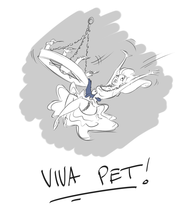
Viva Pet!


Unless you know the show or read the books, this will be lost on you, however if you wish to understand, please read on. The blue thing is 'Pet', a character on the Edgar and Ellen series. He's a 6 tendriled, hairy 'thing' that is about the size of a cat. We had this script which called for Pet to swing from a chandalier while holding a damsel in distress. Considering his cat-like sizing, we weren't sure how to pull this off. That's when I was inspired to do this sketch. I'm not sure if it's a possibe solution to the problem, but it was sure fun to draw. Enjoy!

Saturday, November 25, 2006


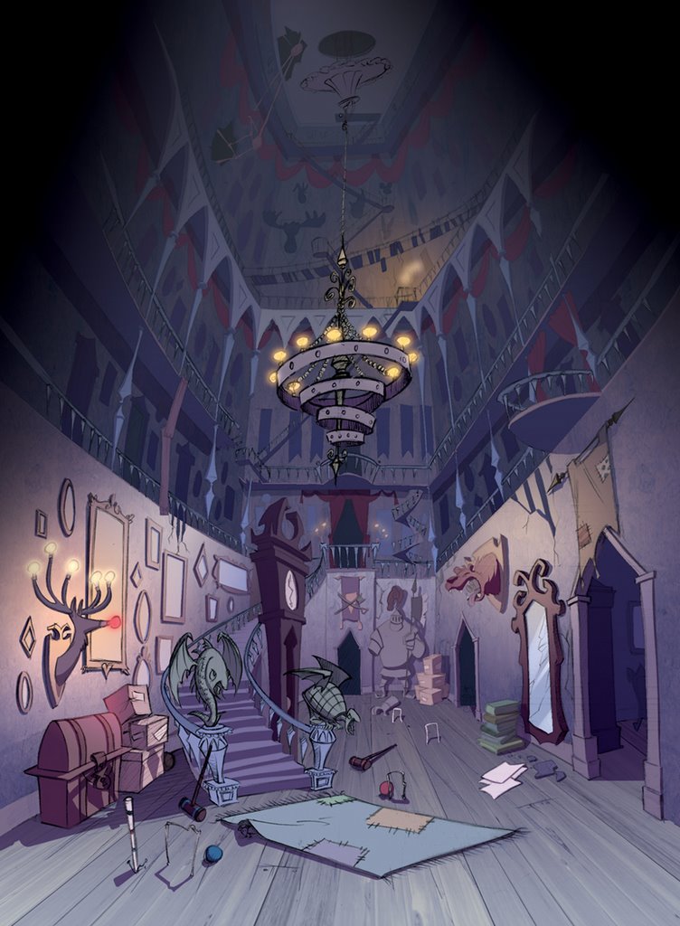
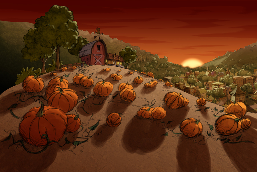
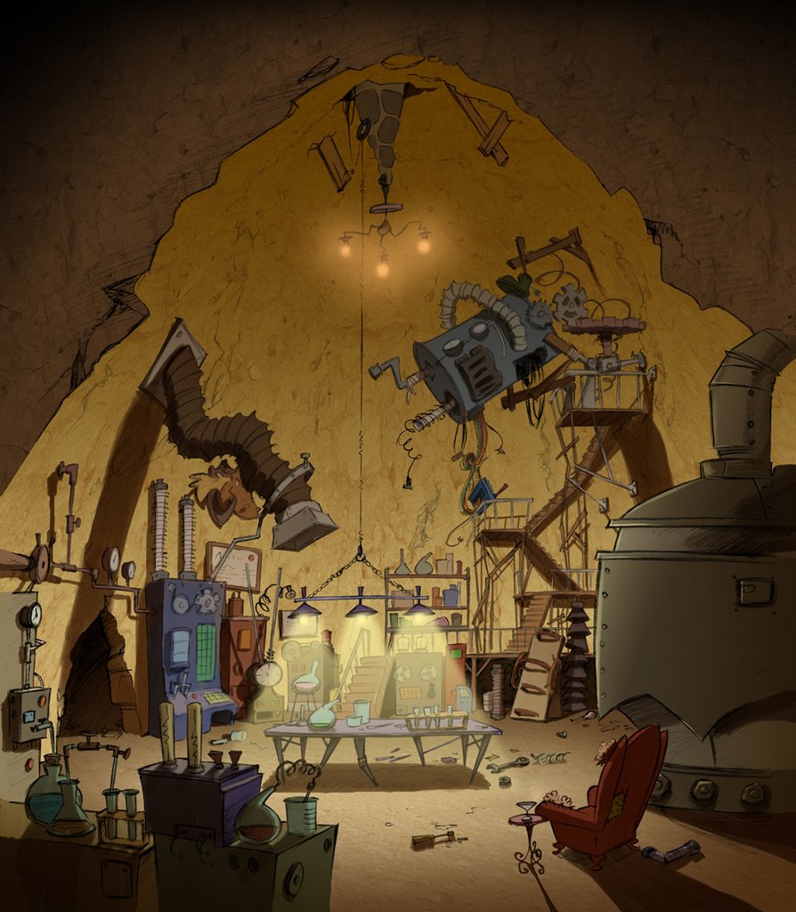
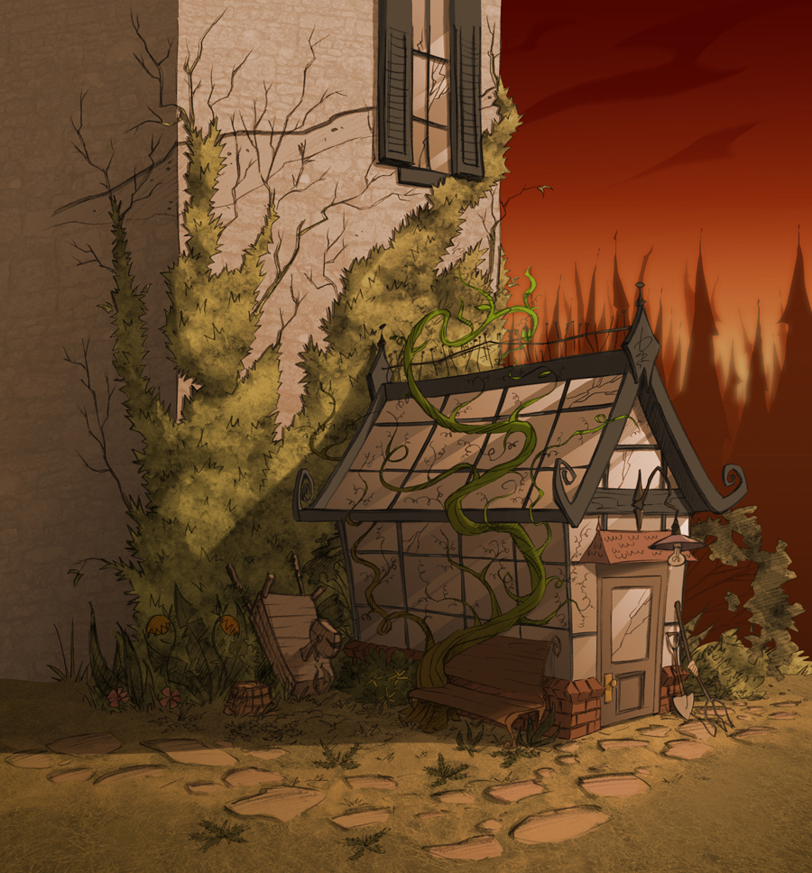
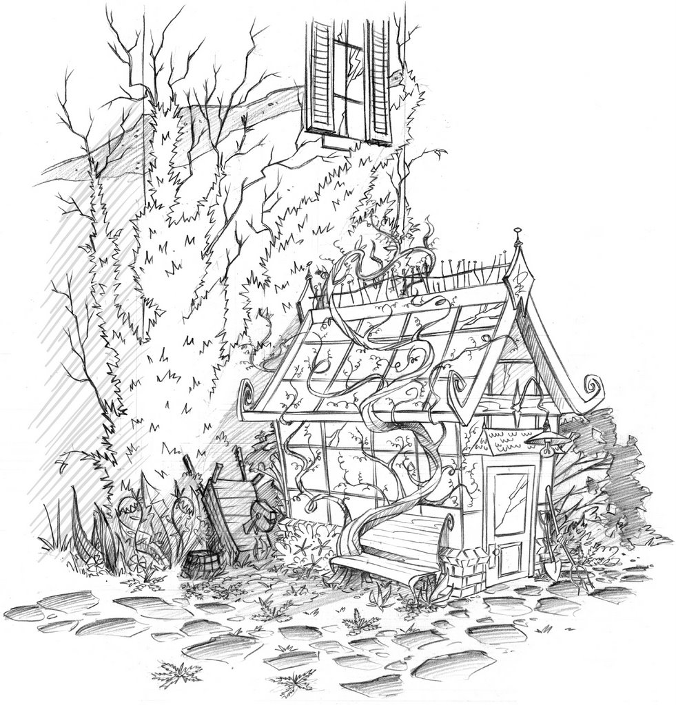
I had wanted to publish something other than background designs, however since that is what my life is all about these days, that's about all I have to post right now. I also wanted to showoff the fantastic work that the color team here at Bardel has been doing with my designs. I've already published the Foyer (top) and the Greenhouse (bottom), and you can see my rough pencil sketches in some earlier postings. The Pumpkin Patch and the Secret Lab are new. It amazes me how much life color can add to a sketch. Unfortunately the martini glass in the Secret Lab was yet another victim of censorship, much like the dog in the Kitchen (see earlier posting). C'est la vie...

Sunday, November 05, 2006


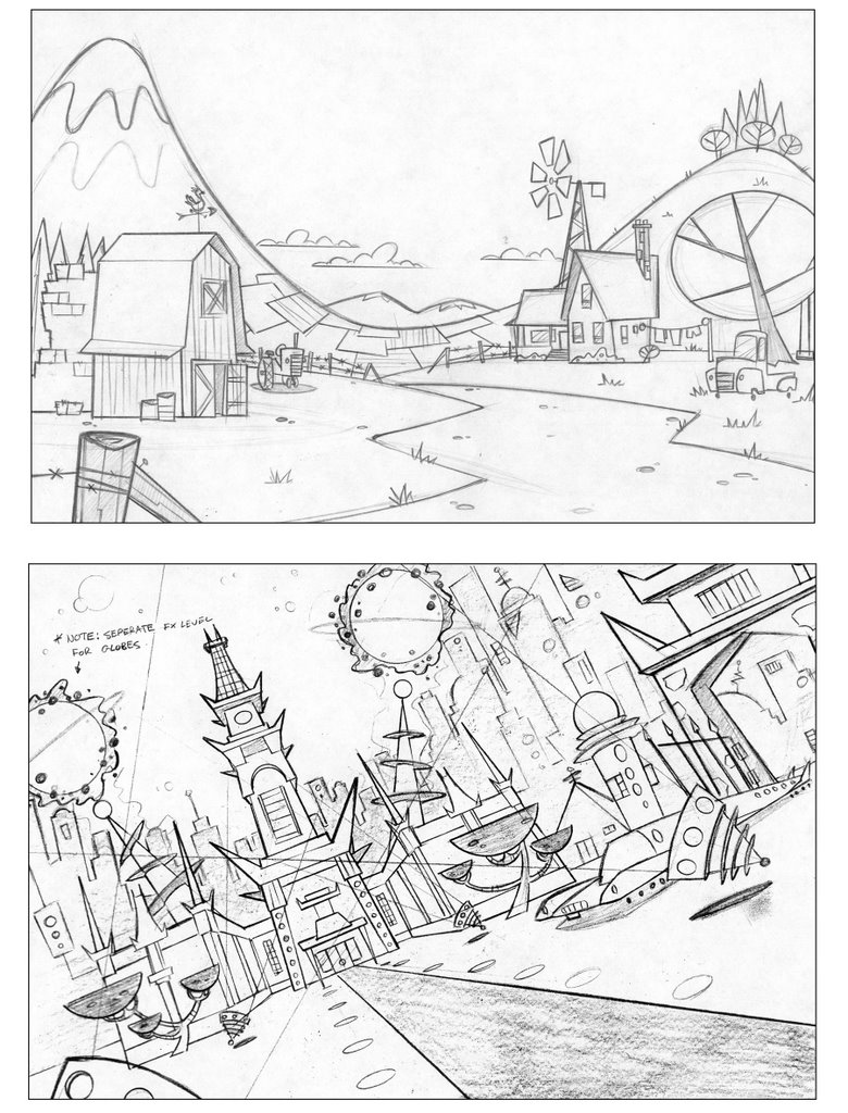
Just thought I'd throw some different styling in for a bit of a change. These are some designs I did while working on 'Atomic Betty', season one. I think of all the backgrounds I did for that show these would have to be my favorite. I really like the farm one, though it did go through some revisions as the scene was to be set in the praries. Ooops. No mountains there I guess. I should learn to read the scripts better. Anywase, it was a great show to work on, and the style was always lots of fun. Quite a change from the intense detail of 'Edgar and Ellen'. I never did see the finished colors, I guess I will have to pick up the DVD's and watch carefully. Would someone let me know if they are out yet? Thanks...

Friday, October 20, 2006

Apparently the Edgar and Ellen Halloween special has aired and so I am guessing I can post yet another design. This is their greenhouse. It has a nice feel to it. I think if I had to do it over I would make it even more overgrown. The color version, which I couldn't find to post, is beautiful! It was colored by the fantastically talented Didier Arpin. In the episode I think it really steals the show. He's just made it look that nice.

Thursday, October 05, 2006

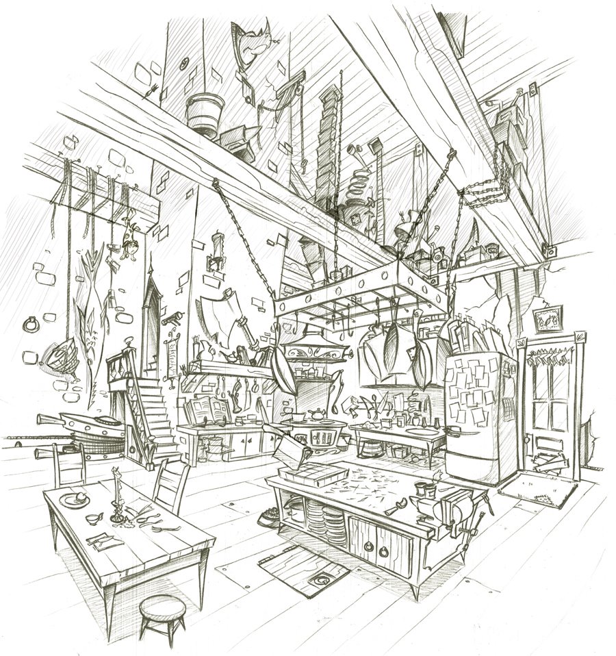
Another design for Edgar and Ellen. This is their kitchen and I think it is my favorite piece, though the Greenhouse is pretty nice as well, if I do say so myself. Much to my delight the puppy in this design was never noticed by anyone and made it all the way to color before being spotted by the client. Of course I was made to remove him. People can be very narrow minded. It still makes me laugh! I find that my work comes under closer scrutiny now. I should have put a moose in there...