Friday, December 15, 2006

Viva Pet!


Unless you know the show or read the books, this will be lost on you, however if you wish to understand, please read on. The blue thing is 'Pet', a character on the Edgar and Ellen series. He's a 6 tendriled, hairy 'thing' that is about the size of a cat. We had this script which called for Pet to swing from a chandalier while holding a damsel in distress. Considering his cat-like sizing, we weren't sure how to pull this off. That's when I was inspired to do this sketch. I'm not sure if it's a possibe solution to the problem, but it was sure fun to draw. Enjoy!

Saturday, November 25, 2006


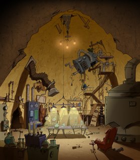
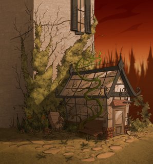
I had wanted to publish something other than background designs, however since that is what my life is all about these days, that's about all I have to post right now. I also wanted to showoff the fantastic work that the color team here at Bardel has been doing with my designs. I've already published the Foyer (top) and the Greenhouse (bottom), and you can see my rough pencil sketches in some earlier postings. The Pumpkin Patch and the Secret Lab are new. It amazes me how much life color can add to a sketch. Unfortunately the martini glass in the Secret Lab was yet another victim of censorship, much like the dog in the Kitchen (see earlier posting). C'est la vie...

Sunday, November 05, 2006


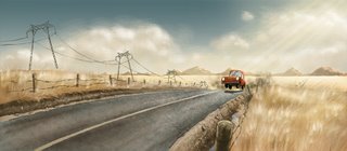
Just thought I'd throw some different styling in for a bit of a change. These are some designs I did while working on 'Atomic Betty', season one. I think of all the backgrounds I did for that show these would have to be my favorite. I really like the farm one, though it did go through some revisions as the scene was to be set in the praries. Ooops. No mountains there I guess. I should learn to read the scripts better. Anywase, it was a great show to work on, and the style was always lots of fun. Quite a change from the intense detail of 'Edgar and Ellen'. I never did see the finished colors, I guess I will have to pick up the DVD's and watch carefully. Would someone let me know if they are out yet? Thanks...

Friday, October 20, 2006

Apparently the Edgar and Ellen Halloween special has aired and so I am guessing I can post yet another design. This is their greenhouse. It has a nice feel to it. I think if I had to do it over I would make it even more overgrown. The color version, which I couldn't find to post, is beautiful! It was colored by the fantastically talented Didier Arpin. In the episode I think it really steals the show. He's just made it look that nice.

Thursday, October 05, 2006

Another design for Edgar and Ellen. This is their kitchen and I think it is my favorite piece, though the Greenhouse is pretty nice as well, if I do say so myself. Much to my delight the puppy in this design was never noticed by anyone and made it all the way to color before being spotted by the client. Of course I was made to remove him. People can be very narrow minded. It still makes me laugh! I find that my work comes under closer scrutiny now. I should have put a moose in there...

Monday, October 02, 2006

Well, the first special in the Edgar and Ellen series aired earlier in September. Apparently it got great reviews and was very highly rated. I missed it of course. To busy getting my limbs frozen off in the ocean at Tofino. But I digress. It occurs to me that since the show has aired, I should be able to post some of the art-work I did for it. I don't know this for certain as I haven't asked anyone, however, if I don't ask then I guess no one can say no. Here's the foyer to the main characters house.

Monday, September 18, 2006

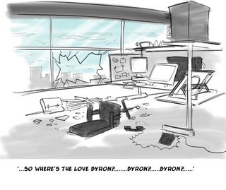
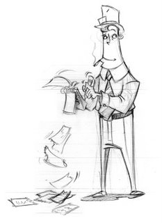
After a few weeks of stress and frustration at work, I did this quick sketch and sent it around the studio. I was amazed at the response I got. Some people said they hadn't laughed so hard in a long time, while others called me at home to make sure I was ok, and some expressed concern about my mental state. Only the amzingly talented Keith Ingham called a revision on it. Looking back of course, he was right. The broken window marking my exit from the scene should have been done in silhouette. Rats. Next time I'll get it right.

Oh, and for those of you who are curious, I'm fine, and as soon as the voices in my head go away I'll be back to normal! Just kidding.

Tuesday, September 12, 2006

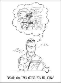
Yesterday we bid farewell to John Shaw. He is one of the true greats in the animation production world and will be missed by all of us here at Bardel. Yeesh, I'm making it sound like he's dead or something! He's not dead, he's just moving on to other things, and we don't want him too.

Good luck John! Wherever you go , I hope you find an Ultimate league that's to your liking!

Tuesday, August 29, 2006

Another caricature of a co-worker, another in-studio joke. She's the one on the right, if you're having trouble figuring it out.

Thursday, August 24, 2006


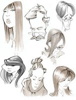
Just a few sketches of some people I work with. I realize that it's no fun looking at other people's inside jokes, and it's even worse trying to explain them, so just take them for what they are, drawings. The top is supposed to be the amazing colorist Didier Arpin, and the other is our girl from the north, Ashley Russell. If you know them I'll let you be the judge as to wether these bare a resemblence at all. I'm sure there will be more to come...

Saturday, August 05, 2006


These are a few designs I did for a Hot Wheels show. They are among my first attempts at organic concept design. The design in the middle has always been my favorite. I think it just has a great feeling about it. Of course the client chose the one on the top, which was naturally my least favorite one. Isn't that just the way it always is....

Tuesday, July 25, 2006


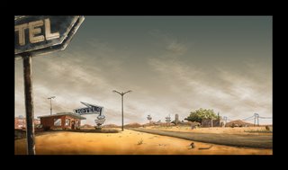
This is a conceptual piece I did a while back. The idea was that this would be a run down 60's era hotel on the outskirts of town. I sketched it first then painted it up in Photoshop. I think it's not bad. I really wanted to capture that dry, desert type of feeling. The clouds are my favorite. Enjoy!

Monday, July 17, 2006


For some reason I find beautiful girls hurting cute animals very funny. Would that be a 'juxtaposition'? Maybe it qualifies as irony. Hmmm...I'm not sure. I'll have to look up Dictionary.com in a minute. Anywase, enjoy!

Thursday, July 06, 2006

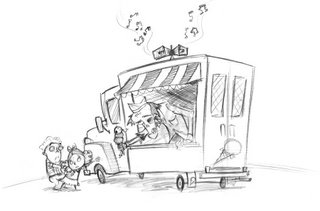
Awhile back I was asked to help with this design for a zombie . I'm not much of a character designer, however I did my best. I came up with several designs, some better than others. My big plan was to distract my Directors attention from my poor designs with some humor, so I slipped this piece in amongst the pile of sketches. I don't know if it worked or not, but he laughed, one of my designs was picked, and I still have my job. Not bad. I'll probably try it again...
Now that I look at it, it's not bad really. Maybe I should try coloring it.

Sunday, June 25, 2006


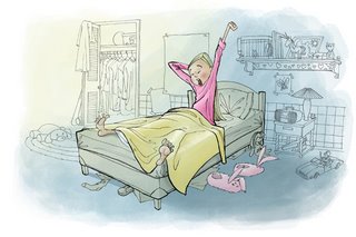
A friend of mine has been working on a series of childrens books. They are design to teach kids about body image and how to deal with being different. I created a few sketches for her. These pictures are for a story about a girl who is really tall for her age and the advantages/disdvantages that go along with that. It's a great idea and I hope the books find their way to a willing publisher.
As the main focus of this particular book was geared towards young girls, I was trying for a softer, almost watercolor-type pallette. By leaving the background with more subddued tones and adding splashes of color I hoped to draw the viewers attention to the main subject of each sketch. It's all pen work and colored in Photoshop.

Saturday, June 17, 2006


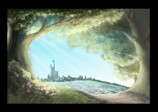
This is a piece I did in Photoshop. I don't feel it's finished yet, however I no longer have a computer powerful enough to handle the file. My six year-old PC just doesn't quite handle large files like this too well. I'm just learning how to paint in photoshop. Some of the artwork I see out there is amazing, so I know I still have a long way to go.

Monday, June 12, 2006

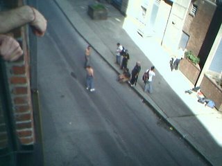
We have this alley right behind the building I work in. For the most part it's empty except for the occasional pot smokers and street people rooting through the garbage. Today however we almost had a fight. 'Almost" is the key word here.
Now I'm not one to promote violence but, if your going to distract me and my fellow artists with yelling and the promise of a good fight, the least you could do is live up to the hype. These guys were lame. Some kicking and name calling. Just like little girls.
For a few precious moments my desk was the most popular spot in the studio, due to it's prime viewing space, and these guys wussed out and walked away. Now the glory is gone....sigh.
Of course I was faced with the moral dilema: call the cops, or take pictures with my cell phone....I'm so awful. So much for a blog about world peace....
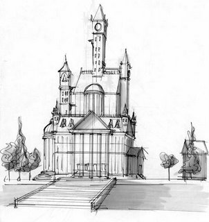
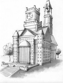
These are a few pieces I did as a test for a studio.


Monday, June 05, 2006

Sunday, June 04, 2006


I'm not sure what the purpose of this Blog is just yet. Till some actual higher purpose can be found (like changing the world), it will simply serve as a place to publish some of my artwork. Enjoy!